Existing Site
Proposed Site
The project brief was to create a 1 Form Entry expansion across age groups of 11-16 year olds. The scheme developed in response to the existing facilities, site constraints and school aspirations. The school has been central to the proposals and consider this project to be a fantastic opportunity enabling:
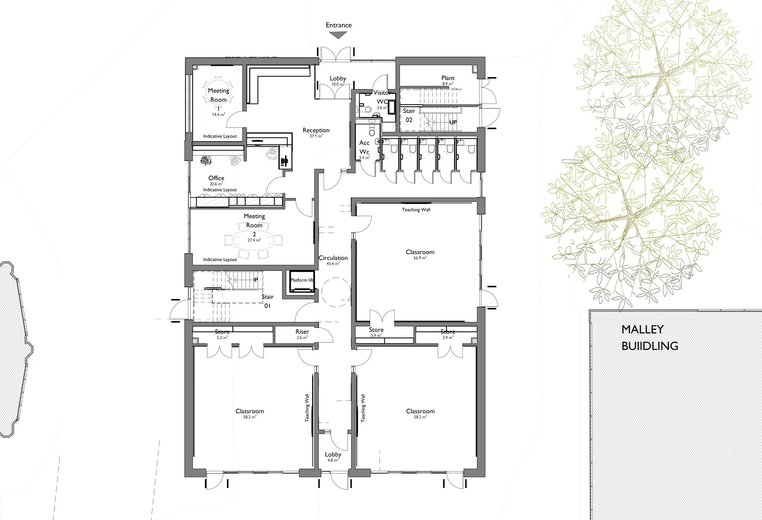
• New modern teaching facilities at the school with the addition of a new 7 classroom block.
• Creation of a central pedestrianised hub, increasing recreational space for students
• Improvement of catering facilities across the site
• Improvements to the landscaping and driveway on approach to the entrance. Increased safety for pedestrians with segregated bus access.
• Improvement to the visitor experience within the introduction of a new reception area and meeting rooms.

The intention of the design proposal is to provide a brand new entrance and teaching building, visible on entering the site. To do this, the design is a simple clean cube with an inset purple box to enable school branding and signage within Alderbrook Academy's signature colour. This provides a focal point that will aid wayfinding, leading visitors to the newly created reception and meeting spaces.
Navigation is important for pupils, parents and visitors that are new to the site.
The scale of the building, choice of white render and proportion of strip window opening is designed to appear as a pavilion set within the landscape. The palette of materials has been kept to a minimum. This is to keep design and installation detailing simple, robust and to a high quality.
Ground Floor
First Floor
Concept Presentation Boards


